Varda
Global FieldID
SoilHive
Varda logos
8.2 KB
SVG
Logotipo primário da Varda (svg)

4.93 KB
PNG
Logotipo de orientação primária
8.22 KB
SVG
Logotipo de orientação secundária

6.25 KB
PNG
Logotipo de orientação secundária (png)
8.16 KB
SVG
Varda Logo Preto
8.18 KB
SVG
Varda Logo 6 Verde Escuro
7.93 KB
SVG
Varda Logo Branco
7.95 KB
SVG
Varda logo horizontal branco (svg)
Diretriz
Marca
Logotipo
Diretriz do logotipo Varda
03.01.24

Primary orientation
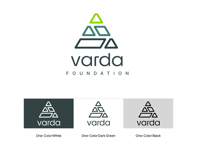
The primary orientation of our logo is vertically stacked.
There are two variations of the primary identity that can be used: a full-color version and a one-color version. The one-color version should only ever appear in one of three colors: white, black, or Varda Dark Green.
The location and application of the logo should be considered when choosing which option to use. When using the full-color logo, it should only ever appear on white or light colored neutral backgrounds (Varda Light Grey, for example).

Secondary orientation
The secondary orientation of our logo is aligned horizontally. This version should only be used in applications where the primary orientation does not work.
There are two variations of the secondary identity that can be used: a full-color version and a one-color version. The one-color version should only ever appear in one of three colors: white, black, or Varda Dark Green.
Just like the primary identity, the location and application of the logo should be considered when choosing which option to use. When using the full-color logo, it should only ever appear on white or light colored neutral backgrounds (Varda Light Grey, for example).

Circle
In some select applications this circular lockup can be used, for example, merchandising and clothing applications or a web footer.
This lockup can function as a way for Varda to convey a “seal of approval” or signify our credibility.
Safe space
Our identity needs room to breathe – it deserves respect. With that in mind, to maximize legibility, don’t crowd the mark, and avoid putting other graphic elements too close.
Reference the diagrams on this page to calculate an accurate and consistent safe space for the mark. Other graphic elements and text should stay outside the safe space.

Logo files
There are two file types for each version of the logo. For all print work, use the .eps version of the file. For all digital executions, use the .png file.
Color versions of the logo with “_rgb” in the filename are for digital use only. For anything that needs to be printed, use the file with “_cmyk” in the name.

